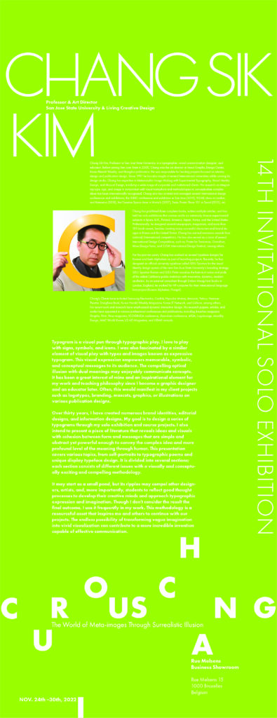
Exhibition name:
“Imaginary Games and Metaphorical Games: Meta image World in Surreal Illusions”
(Chang SiK KimThe 14th solo exhibition)


Venue:
Rue Melsens Business Showroom
Exhibition time:
November 24th through 30, 2022
Opening ceremony of the exhibition:
November 24th Monday from 5PM to 6:30PM
Exhibition planning:
China Europe International Design Culture Association(CEIDA)
Biography
Chang Sik Kim, Professor at San José State University, is a typographer, visual communication designer, and educator. Before joining San Jose State in 2000, Chang was the art director at Seoul Graphic Design Center, Korea Herald Weekly, and Hangilsa publication. He was responsible for leading projects focused on identity design and publication design. Since 1991 he has also taught at several international universities while running his design studio. Chang has expertise in Metamorphic Image Making with Experimental Typography, Visual Identity Design, and Mascot Design, involving a wide range of corporate and institutional clients. His research on integrating type, sign, and image in conjunction with visual metaphors and methodologies to conceptualize complex ideas has been internationally recognized. Chang also has curated and managed several international design conferences and exhibitions; the IDEEC conference and exhibition in San Jose (2019), VIDAK show in London, and Katowice (2018), the Creative Space show in Munich (2017), Swiss Poster Show 101 in Seoul (2015), etc.
Chang has published three complete books, written multiple articles, and has held ten solo exhibitions that contain works on extremely diverse experimental subjects in Spain, U.K., Poland, Armenia, Japan, Korea, and the United States. Professionally, he designed several newspapers, magazines, and more than 150 book covers, besides creating many successful characters and brand designs in Korea and the United States. Chang has earned numerous awards from national/international competitions. He has also served as a Juror of several International Design Competitions, such as; Poster for Tomorrow, Granshan, Wow Design Festa, and COW International Design Festival, among others.
For the past ten years, Chang has worked on several typeface designs for Korean and Latin Alphabets as part of branding projects. Recently, he designed an official university typeface called SJSU Spartan for the visual identity design system of the new San Jose State University’s branding strategy. SJSU Spartan Roman and SJSU Pride visualize the historical value and pride of the oldest California public institution with innovative, dynamic, modern aesthetics. As an external consultant through Dalton Maag Font Studio in London, England, he worked for HP computer for their international language font project (Korean Alphabet, Hangul).
Chang’s Clients have included Samsung Electronics, Cooliris, Hyundai Motors, Amazon, Yahoo, Hammer Theatre, Donghwa Bank, Korea Herald Weekly Magazine, Korea IT Network, and Celluon, among others. His recent work and research have emphasized dynamic interactive design. His research papers, articles, and works have appeared in various professional conferences and publications, including Baseline magazine Graphis, Print, How magazine, ICOGRADA conference, Granshan conference, AIGA, Logolounge, Monthly Design, MAC World Korea, LG AD Magazine, and VIDAK annuals.
Exhibition Description:
Typogram is a visual pun through typographic play. I love to play with signs, symbols, and icons. I was also fascinated by a similar element of visual play with types and images known as expressive typogram. This visual expression empowers memorable, symbolic, and conceptual messages to its audience. The compelling optical illusion with dual meanings may enjoyably communicate concepts. It has been a great interest of mine and an inspirational element for my work and teaching philosophy since I become a graphic designer and an educator later. Often, this would manifest in my client projects such as logotypes, branding designs, mascots, graphics, or illustrations on book designs.
Over thirty years, I have created numerous brand identities, editorial designs, and information designs. My goal is to design a series of typograms through my solo exhibition and course projects. I also intend to present a piece of literature that reveals ideas and visuals with cohesion between form and messages that are simple and abstract yet powerful enough to convey the complex and more profound level of the meaning through humor. This presentation covers various topics, from self-portraits to typographic poems and unique display typeface design. It is divided into several sections; each section consists of different issues with a visually and conceptually exciting and compelling methodology.
It may start as a small pond, but its ripples may compel other designers, artists, and, more importantly, students to reflect good thought processes to develop their creative minds and approach typographic expression and imagination. Though I don’t consider the result the final outcome, I use it frequently in my work. This methodology is a resourceful asset that inspires me and others to continue with our projects. The endless possibility of transforming vague imagination into vivid visualization can contribute to a more incredible invention capable of effective communication.


